Business heads often use KPI tracking dashboards that provide a quick overview of their company’s performance and well-being. A KPI tracking dashboard collects, groups, organizes and visualizes the company’s important metrics either in a horizontal or vertical manner. The dashboard provides a quick overview of business performance and expected growth.
An effective and visually engaging way of presenting the main figures in a dashboard is to build a KPI belt by combining text, visual cues and icons. By using KPI dashboards, organizations can access their success indicators in real time and make better informed decisions that support long-term goals.
What is a KPI?
KPIs (i.e.Key Performance Indicators) are also known as performance metrics, performance ratios or business indicators. A Key Performance Indicator is a measurable value that demonstrates how effectively a company is achieving key business objectives.
A sales tracking dashboard provides a complete visual overview of the company’s sales performance by year, quarter or month. Additional information such as the number of new leads and the value of deals can also be incorporated.
Example of KPIs on a Sales Dashboard:
- Number of New Customers and Leads
- Churn Rate (i.e. how many people stop using the product or service)
- Revenue Growth Rate
- Comparison to Previous Periods
- Most Recent Transactions
- QTD (quarter to date) Sales
- Profit Rate
- State Wise Performance
- Average Revenue for Each Customer
Bringing It All Together with Dashboards and Stories
An essential element of Tableau’s value is delivered via dashboards. Well-designed dashboards are visually engaging and draw in the user to play with the information. Dashboards can facilitate details-on-demand that enable the information consumer to understand what, who, when, where, how and perhaps even why something has changed. This is where Tableau development services come into play, enabling customized solutions tailored to business-specific metrics.
Best Practices to Create a Simple and Effective Dashboard to Observe Sales Performance KPIs
A well-framed KPI dashboard instantly highlights problem areas. The greatest value of a modern business dashboard lies in its ability to provide real-time information about a company’s sales performance. As a result, business leaders, as well as project teams, are able to make informed and goal-oriented decisions, acting on actual data instead of gut feelings. The choice of chart types on a dashboard should highlight KPIs effectively. If you’re looking to implement these practices in your organization, working with Tableau experts ensures your dashboards follow industry standards and drive actionable insights.
Bad Practices Examples in a Sales Dashboard:
- A sales report displaying 12 months of history for twenty products; 12 × 20 = 240 data points.
- Multiple data points do not enable the information consumer to effectively discern trends and outliers as easily as a time-series chart comprised of the same information
- The quality of the data won’t matter if the dashboard takes five minutes to load
- The dashboard fails to convey important information quickly
- The pie chart has too many slices, and performing precise comparisons of each product sub-category is difficult
- The cross-tab at the bottom requires that the user scroll to see all the data
Now, we will focus on thebest practices to create an effective dashboardto convey the most important sales information. Tableau is designed to supply the appropriate graphics and chart types by default via the “Show me” option.
I. Choose the Right Chart Types
With respect to sales performance, we can use the following charts to show the avg. sales, profits, losses and other measures.
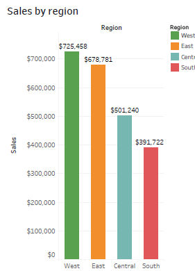
- Bar chartsto compare numerical data across categories to show sales quantity, sales expense, sales revenue, top products and sales channel etc. This chart represents sales by region.
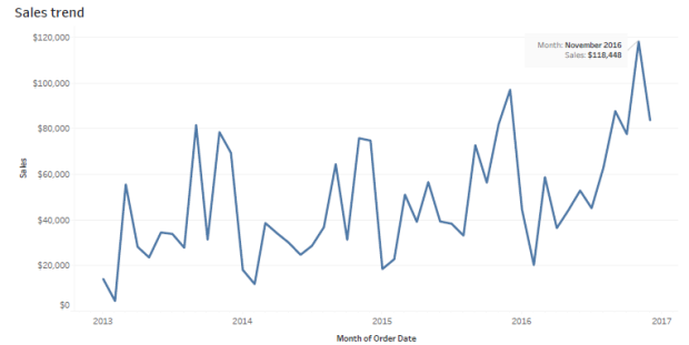
- Line chartsto illustrate sales or revenue trends in data over a period of time:
- AHighlight tableallows us to apply conditional formatting (a color scheme in either a continuous or stepped array of colors from highest to lowest) to a view.

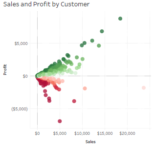
- UseScatter plotsorscatter graphsto investigate the relationship between different variables or to observe outliers in data. Example: sales vs profit:
- UseHistogramsto see the data distribution across groups or to display the shape of the sales distribution:

Advanced Chart Types:
- UseBullet graphsto track progress against a goal, a historical sales performance or other pre-assigned thresholds:

- TheDual-line chart(or dual-axis chart), is an extension of the line chart and allows for more than one measure to be represented with two different axis ranges. Example: revenue vs. expense
- ThePareto chartis the most important chart in a sales analysis. The Pareto principle is also known as 80-20 rule; i.e roughly 80% of the effects come from 20% of the causes.
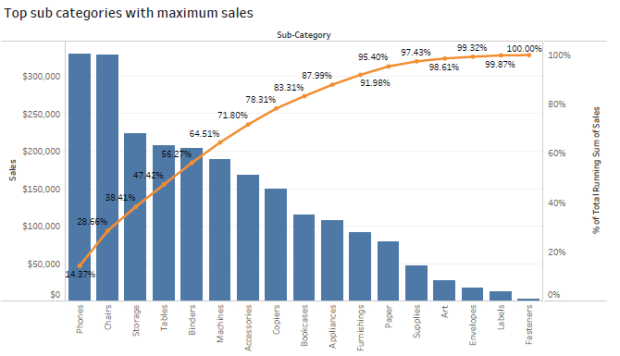
When performing a sales analysis, this rule is used for detecting the 80% of total sales derived from 20% of the products.
- UseBox plotsto display the distribution of data through their quartiles and to observe the major data outliers
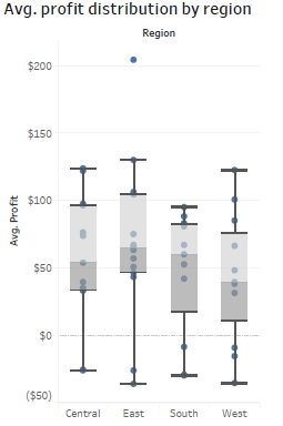
Tableau Sales Dashboard
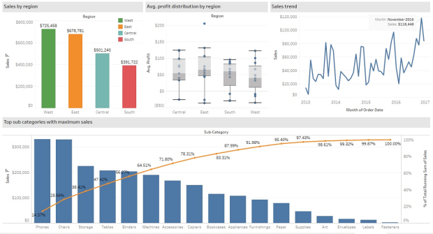
Here is a Tableau dashboard comprised of the aforementioned charts. This interactive dashboard enables the consumer to understand sales information by trend, region, profit and top products.
II. Use Actions to filter instead of Quick Filters
Using actions in place of Quick Filters provides a number of benefits. First, the dashboard will load more quickly. Using too many Quick Filters or trying to filter a very large dimension set can slow the load time because Tableau must scan the data to build the filters. The more quick filters enabled on the dashboard, the longer it will take the dashboard to load.
III. Build Cascading Dashboard Designs to Improve Load Speed
By creating a series of four-panel, four cascading dashboards the load speed was improved dramatically and the understandability of the information presented was greatly enhanced. The top-level dashboard provided a summary view, but included filter actions in each of the visualizations that allowed the executive to see data for different regions, products, and sales teams.
IV. Remove All Non-Data-Ink
Remove any text, lines, or shading that doesn’t provide actionable information. Remove redundant facts. Eliminate anything that doesn’t help the audience understand the story contained in the data.
V. Create More Descriptive Titles for Each Data Pane
Adding more descriptive data object titles will make it easier for the audience to interpret the dashboard. For example:
- Bullet Graph—Sales vs. Budget by Product
- Sparkline—Sales Trend
- Cross-tab—Summary by Product Type
- Scatter Plot—Sales vs. Marketing Expense
VI. Ensure That Each Worksheet Object Fits Its Entire View
When possible, change the graphs fit from “Normal” to “Entire View” so that all data can be displayed at once.
VII. Adding Dynamic Title Content
There is an option to use dynamic content and titles within Tableau. Titles can be customized in a dynamic way so that when a filter option is selected, the title and content will change to reflect the selected value. A dynamic title expresses the current content. For example: if the dashboard title is “Sales 2013” and the user has selected year 2014 from the filter, the title will update to “Sales 2014”.
VIII. Trend Lines and Reference Lines
Visualizing granular data sometimes results in random-looking plots. Trend lines help users interpret data by fitting a straight or curved line that best represents the pattern contained within detailed data plots. Reference lines help to compare the actual plot against targets or to create statistical analyses of the deviation contained in the plot; or the range of values based on fixed or calculated numbers.
IX. Using Maps to Improve Insight
Seeing the data displayed on a map can provide new insights. If an internet connection is not available, Tableau allows a change to locally-rendered offline maps. If the data includes geographic information, we can very easily create a map visualization.
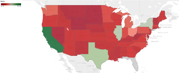
This map represents sales by state. The red color represents negative numbers and the green color represents positive numbers.
X. Developing an Ad Hoc Analysis Environment
Tableau facilitates ad hoc analysis in three ways:
- Generating new data with forecasts
- Designing flexible views using parameters
- Changing or creating designs in Tableau Server
XI. Using Filters Wisely
Filters generally improve performance in Tableau. For example, when using a dimension filter to view only the West region, a query is passed to the underlying data source, resulting in information returned for only that region. We can see the sales performance of the particular region in the dashboard. By reducing the amount of data returned, performance improves.
Enhance Visualizations Using Colors, Labels etc.
I. Using colors:
Color is a vital way of understanding and categorizing what we see. We can use color to tell a story about the data, to categorize, to order and to display quantity. Color helps with distinguishing the dimensions. Bright colors pop at us, and light colors recede into the background. We can use color to focus attention on the most relevant parts of the data visualization. We choose color to highlight some elements over others, and use it to convey a message.
Red is used to denote smaller values, and blue or green is used to denote higher values. Red is often seen as a warning color to show the loss or any negative number whereas blue or green is seen as a positive result to show profit and other positive values.
Without colors:
 With colors:

II. Using Labels:
Enable labels to call out marks of interest and to make the view more understandable. Data labels enable comprehension of exact data point values. In Tableau, we can turn on mark labels for marks, selected marks, highlighted marks, minimum and maximum values, or only the line ends.
Without labels:

With labels:
 Using Tableau to enhance KPI values
The user-friendly interface allows non-technical users to quickly and easily create customized dashboards. Tableau can connect to nearly any data repository, from MS Excel to Hadoop clusters. As mentioned above, using colors and labels, we can enhance visualization and enhance KPI values. Here are some additional ways by which we can enhance the values especially with Tableau features.
I. Allow for Interactivity
Playing, exploring, and experimenting with the charts is what keeps users engaged. Interactive dashboards enable the audiences to perform basic analytical tasks such as filtering views, drilling down and examining underlying data – all with little training.
II. Custom Shapes to Show KPIs
Tableau shapes and controls can be found in the marks card to the right of the visualization window. There are plenty of options built into Tableau that can be found in the shape palette.

Custom shapes are very powerful when telling a story with visualizations in dashboards and reports. We can create unlimited shape combinations to show mark points and create custom formatting. Below is an example that illustrates how we can represent the sales or profit values with a symbolic presentation.

Here green arrows indicate good sales progress and red arrows indicate a fall in Year over Year Sales by Category
III. Creating Calculated Fields
Calculated fields can be used to create new dimensions such as segments, or new measures such as ratios. There are many reasons to create calculated fields in Tableau. Here are just a few:
- Segmentation of data in new ways on the fly
- Adding a new dimension or a new measure before making it a permanent field in the underlying data
- Filtering out unwanted results for better analyses
- Using the power of parameters, putting the choice in the hands of end users
- Calculating ratios across many different variables in Tableau, saving valuable database processing and storage resources
IV. Data-Driven Alerts
With version 10.3, Tableau has introduced a very useful feature: Data-Driven Alerts. We may want to use alerts to notify users or to remind that a certain filter is on and want to be alerted somehow if performance is ever higher or lower than expected. Adding alerts to dashboards can help elicit necessary action by the information consumer. This is an example of a data driven alert that we can set while displaying a dashboard or worksheet.
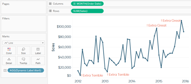
In a Tableau Server dashboard, we can set up automatic mail notifications to a set of recipients when a certain value reaches a specific threshold.
Summary
For an enterprise, a dashboard is a visual tool to help track, monitor and analyze information about the organization. The aim is to enable better decision making. To ensure these dashboards effectively align with sales and revenue goals, tableau professional services provide tailored visual analytics solutions.
A key feature of sales dashboards in Tableau is interactivity. Dashboards are not simply a set of reports on a page; they should tell a story about the business. In order to facilitate the decision-making process, interactivity is an important part of assisting the decision-maker to get to the heart of the analysis as quickly as possible.
Find the right Tableau solution for your business. Explore our Tableau services:
Tableau Consultants | Tableau Consulting | Tableau Expert | Tableau Contractor | Tableau Freelance Developer | Tableau Developer | Tableau Partner Company

 Using Tableau to enhance KPI values